


Or: turning conflicting reports into something that resembles insight.
Programmatic UA would be easier if data played by the rules. Instead, you get mismatched reports, shifting formats, and column headers that change mood weekly. Your job? Make it all line up. Make it make sense. Ideally before Slack lights up with “hey, quick question…”
Let’s break down the madness:
📦 Box #1: The DSP Universe
Your source for all things traffic. Campaigns, creatives, bids, bundles, impressions, clicks, installs, costs… it’s like a party where everyone showed up but forgot to wear name tags.
📲 Box #2: The MMP Dimension
This is where attribution lives. Installs, post-install events, funnels, LTV… if you’re lucky, you have clean access. If not, someone forwards you a raw CSV on a Friday evening with 300k rows and no headers. Classic.
📊 Box #3: The Land of Payouts & KPIs
Structured (ish) data on what you earn per app, per geo, or per bundle. Sometimes clear, sometimes… interpretative. Like abstract art, but in spreadsheet form.
Now, if you’re trying to make sense of ROI, profit or revenue without combining these three worlds… well, may the gods of pivot tables be with you 🧯
Because true performance insight doesn’t come from looking at one source, it comes from connecting the dots across all of them.
So… what works?
There’s no universal template. But there is a battle-tested combo we rely on—and it’s not glamorous, but it works like a charm.
Excel – The first aid kit 🔧
This is where the cleanup begins. Think of it as the triage room for incoming data.
You’ll use Excel to:
SQL – The secret weapon 🧠
Once your data’s looking semi-respectable, SQL takes the stage. This is where real structure happens.
Use it to:
Power BI – The stage 📊
Now that your data is behaving, it’s time to make it speak. Power BI turns rows into stories.
Use it to:
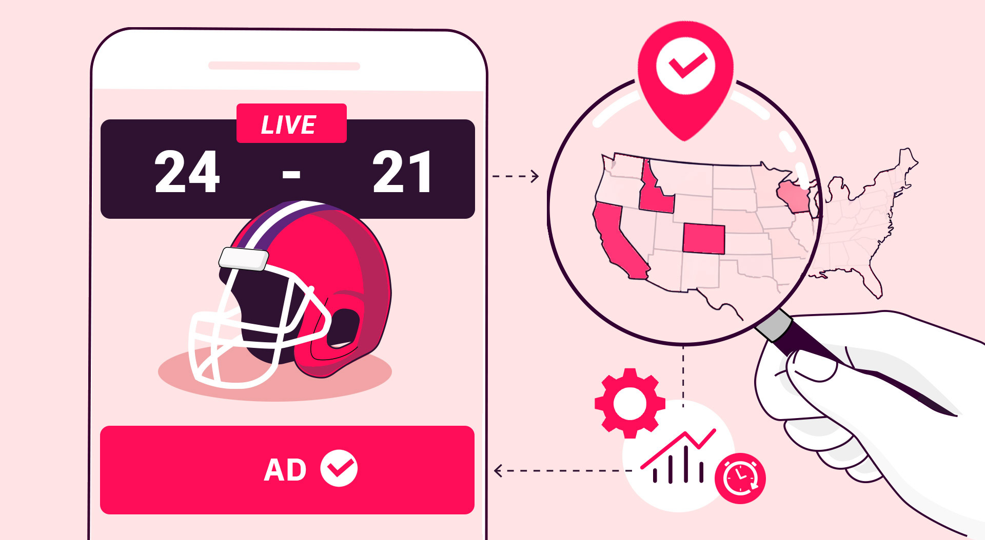
It’s how you go from “let’s increase spend” to “but not on iOS in CA after 5pm—it’s eating margin.” In the end, performance isn’t just about more traffic or better creatives. It’s about building systems that turn noise into signal.
And let’s be honest—nothing beats the feeling of watching a dashboard light up after days of data wrangling and thinking,
“Oh… so that’s where the money went.” 💸
Subscribe to our newsletter
Important Security Notice
Beware of scammers impersonating Tappx brand
We have identified fraudulent activities where malicious actors are imitating Tappx assets. These scams may compromise your security.
⚠️ Warning: The URL you came from has been flagged as potentially harmful.
To stay safe, only trust communications and services from the official Tappx domain: tappx.com