


1 min read


The design of your app logo can be a key factor in your user acquisition strategy such as working with a knowledgeable Account Manager and other tips we talk about in Tappx blog. After a user searches for some keywords, an eye-catching logo will win and attract more of those potential users to the app page. There is no magic formula or picture-perfect logo that will increase app downloads by millions, but showing that the essence of the app starts from the logo will increase conversions and give a totally new image to your app.
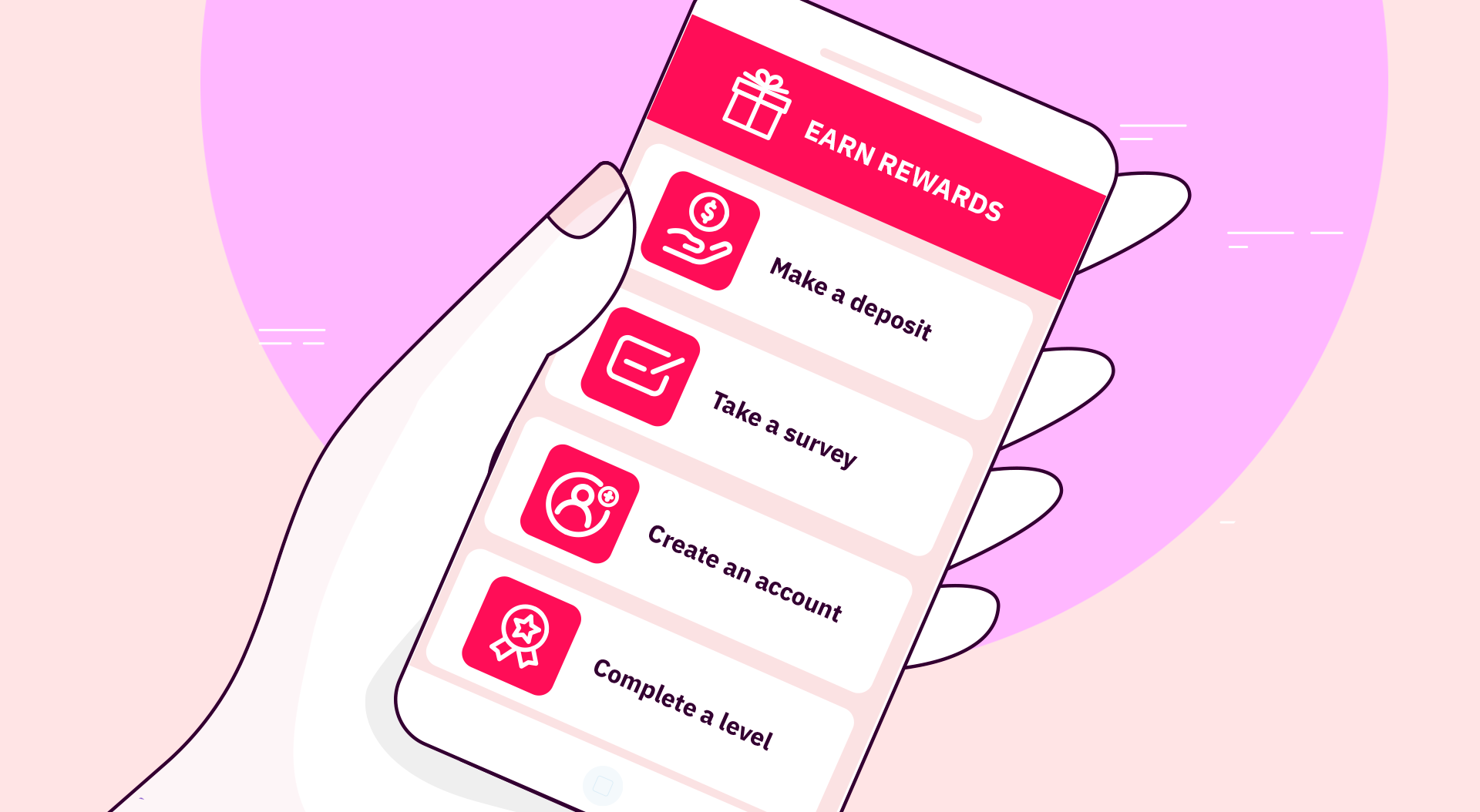
This article presents basic tips and essential tools that will increase your app downloads and improve your app promotion results.
The borders of your icon are like the underline of a title, they will make it stand out from others and will call attention to the center. Of course, borders aren’t a “must-have”; many apps are successful without them, but they’re a simple way to improve the look and feel from a basic icon and move forward into an app design style. Fill up the space within the borders as much as you can, and get creative with it!
Using borders and design trends your logo can stand out from others and increase app downloads.
It is vital that your app’s design remains in line with trends and best practices. Otherwise, your icon and screenshots will transmit the feeling of being old and outdated in comparison with other apps, and users won’t trust enough the quality to download it.
End users can be attracted to your app simply by the different colors and tones in the logo. Adjusting these features can make your app stand out in the rankings among similar apps in the store and increase app downloads.
You can follow these useful tips:
Keep in mind that logos can be viewed at different sizes depending on the context. For example, in the app stores, they appear bigger than on one’s home screen. For this reason, make sure that the image can adapt to any size when being reduced.
[TOOL!] Finally, we recommend you Make an App Icon. It is a useful tool that allows developers to generate their logos in just one click, adapting it to Android and iOS.
Now go for it! You already know all the best practices to create the perfect logo to increase your app downloads.
Subscribe to our newsletter
Important Security Notice
Beware of scammers impersonating Tappx brand
We have identified fraudulent activities where malicious actors are imitating Tappx assets. These scams may compromise your security.
⚠️ Warning: The URL you came from has been flagged as potentially harmful.
To stay safe, only trust communications and services from the official Tappx domain: tappx.com